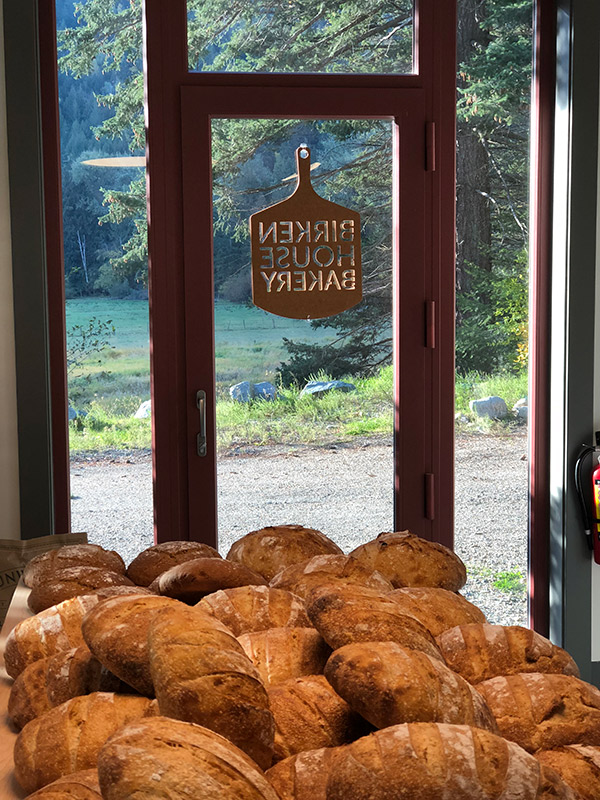
Birken House Bakery was new to their community and required a visual brand identity that was highly recognizable and yet felt familiar in their small community.
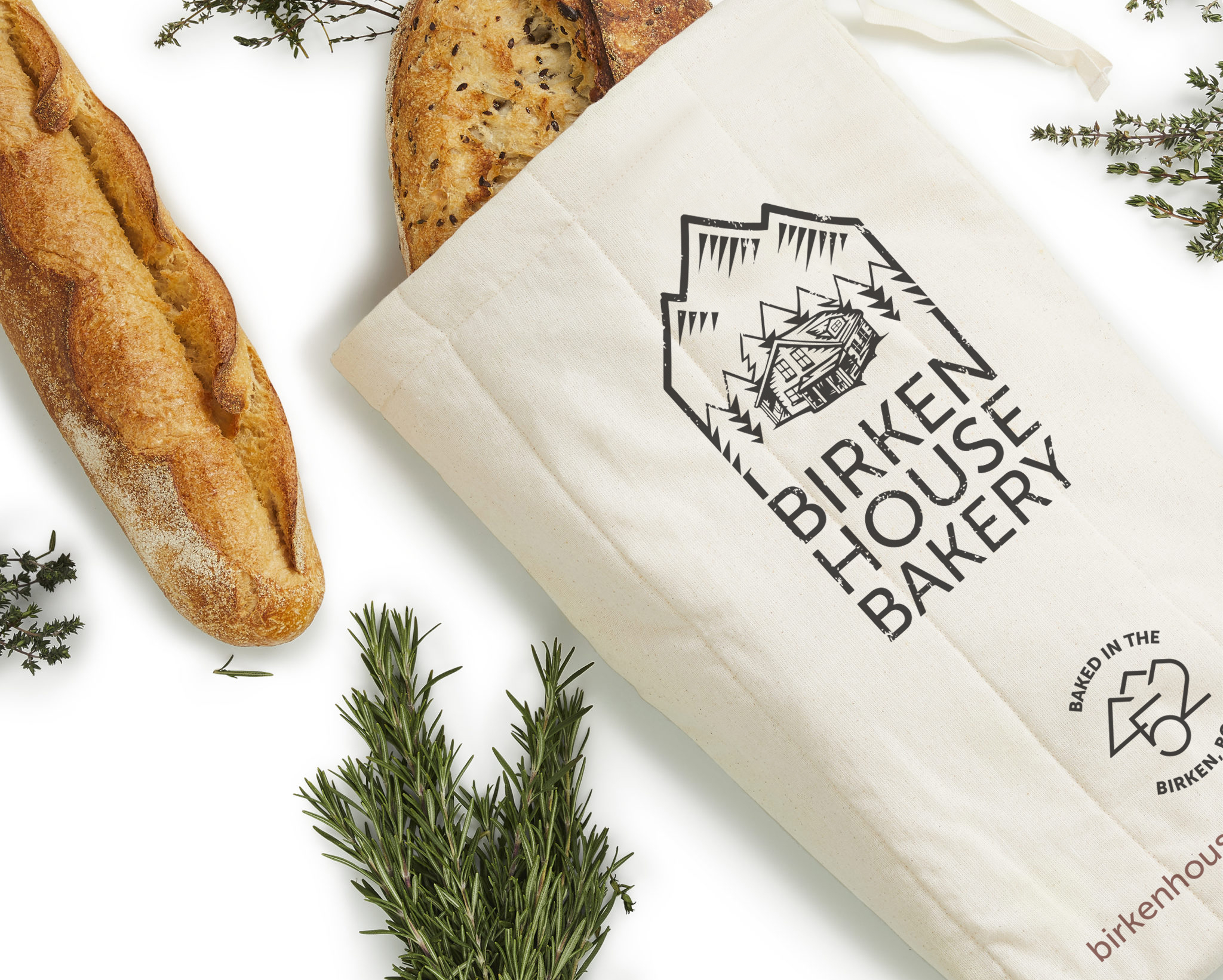
I worked with Eileen to reveal the values that their logo should communicate: providing healthy high-quality bread and accompaniments to their neighbourhood.


As we talked through the concepts, we chose a logo that reflected the unique community they served. The house that is featured in the logo is the owners historical home they purchased when they decided to move to the small community. It is well known as one of the first buildings in the region of Birken.
The logo and accompanying graphic design complemented the community Birken House Bakery serves, diverse and modern with an old fashioned aesthetic. With the new brand identity, Birken House Bakery stood out, yet fit in with the traditional feel of the area.
Birken House Bakery quickly began to sell out at the local craft markets and to keep up with demand they began construction on a new larger capacity bakery.