Brand Identity Design, User Experience + User Interface Design
Brougham Outdoor
We at Glacier Media Digital worked with Brougham Outdoor to produce this Brand Identity and Digital/Print Collateral to help convey the brand's mission of transforming outdoor spaces into luxury retreats through exceptional design, premium craftsmanship, and personalized service.
Brougham Outdoor curates the finest outdoor furnishings, delivering a seamless experience that combines style, comfort and durability. Their commitment is to provide their clients with bespoke solutions that inspire relaxation, elevate living, and create lasting memories.
We at Glacier Media Digital worked with Brougham Outdoor ownership to ensure that their logo conveyed their expertise in being a one-stop shop for finding globally renowned outdoor brands under one roof. The ‘B’ conveys comfort, customization, and style, by subtly integrating forms found in outdoor living spaces.

LOGO DESIGN
After drafting various concepts, this logo was chosen that represent the values of shaping every interaction and product they offer, reflecting a deep commitment to quality, craftsmanship, and the unique needs of their clients. With an unwavering dedication to excellence, they take pride in offering beautiful, long-lasting pieces that elevate outdoor living. They build trust through open, honest communication and are passionate about delivering personalized experiences that cater to individual needs. At the heart of everything they do is a client-first approach, ensuring that every detail exceeds expectations
This logo and the accompanying visual identity create a strong and reputable aesthetic. With this new brand identity, we worked with Brougham Outdoor to develop a website that shared the values of excellence, integrity, innovation, personalization and client focused.


DIGITAL
—
With a new Brand Identity, Brougham Outdoor required a new e-commerce website that could showcase its products and feature the company's history, businesses, and capabilities.


VISUAL LANGUAGE
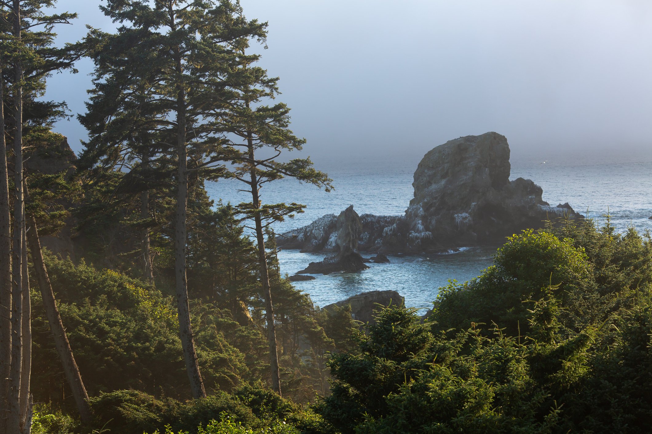
The colour palette was developed to evoke a vibrant palette reflecting its diverse landscapes and environments. The deep black, sandy brown, and rich camel symbolize the rocky shores of the Pacific Northwest, while light grey sand and vibrant green, turquoise, and light blue accent colours represent the dynamic seasonal tones. This colour palette conveys the unspoiled beauty of the West Coast’s landscapes.
TYPOGRAPHY
GLYPH

CHARACTERS

Primary

Secondary
STYLES

COLOUR PALETTE


DESIGN COLLATERAL
—
With a new Brand identity created, there was an opportunity to build relevant brand pieces in various environments that would add credibility and awareness to Brougham Outdoor.


—
The Brougham Outdoor print pieces echo the subtle colours and modern type treatment, ensuring that the modern and sophisticated aesthetic resonates in all collateral.


